
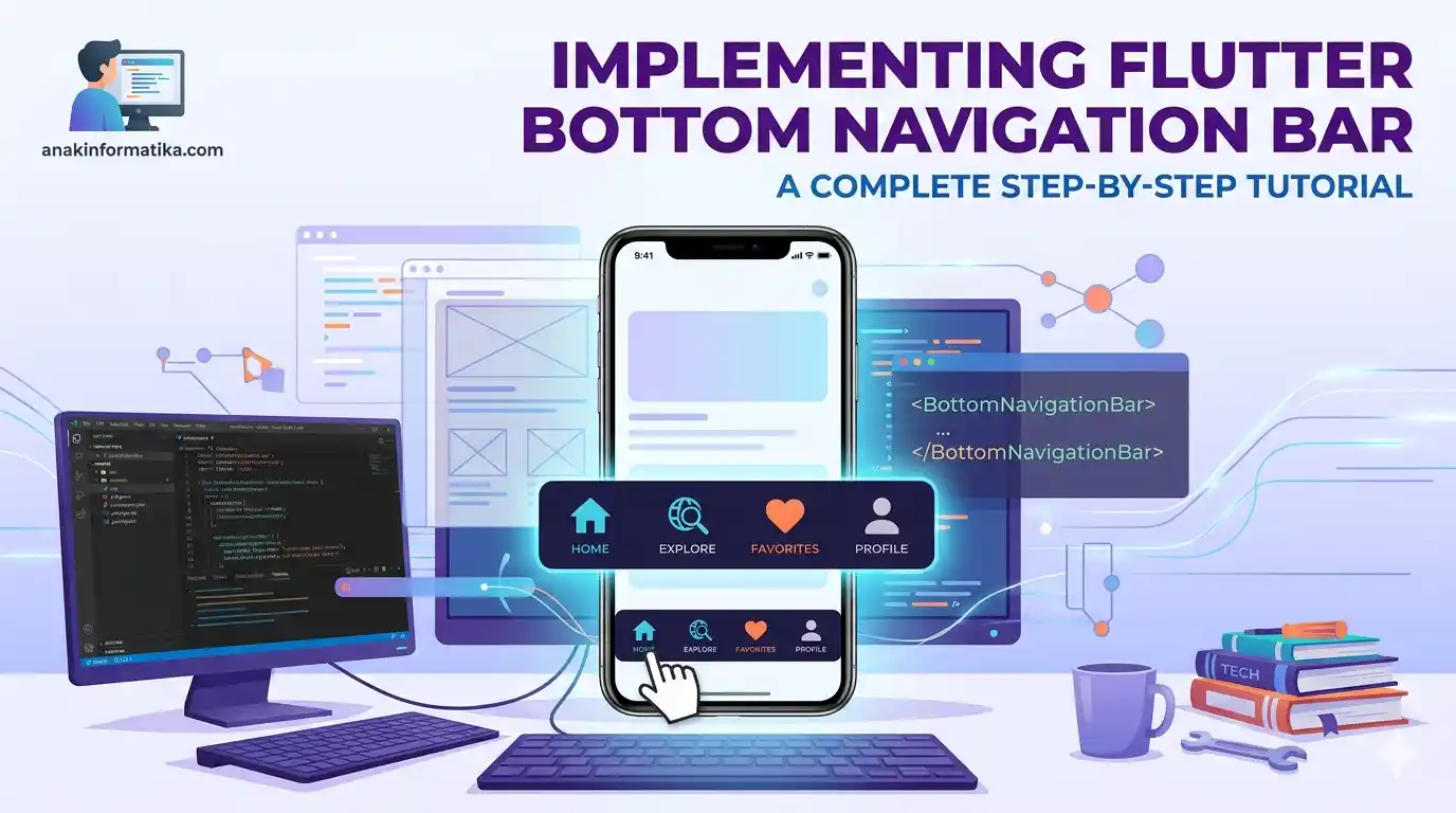
Introduction: Why is a Bottom Navigation Bar Important?
In the world of mobile app development, User Experience (UX) is everything. One of the most crucial UI components for navigation and the discoverability of core features is the Bottom Navigation Bar. This component allows users to switch between the main sections of an app quickly and intuitively with just a single tap of a finger at the bottom of the screen.
Think of your favorite apps like Instagram, Tokopedia, or WhatsApp. They all use a bottom navigation bar to provide easy access to core features. Without a bottom navigation bar, users might struggle to find or switch between pages, which can lead to a frustrating experience.
Flutter, Google's UI framework, provides a highly flexible and easy-to-use widget to create a bottom navigation bar. This tutorial will guide you step-by-step, from preparation to the full code implementation, so you can build an elegant and functional navigation system in your Flutter application.
Prerequisites
Before we begin, make sure you meet the following prerequisites:
-
Flutter SDK Installed: Ensure you have installed the Flutter SDK and configured it correctly on your system. You can verify this by running the
flutter doctorcommand in your terminal. -
IDE (Integrated Development Environment): Visual Studio Code or Android Studio with the Flutter/Dart plugins installed.
-
Dart and Flutter Basics: A basic understanding of the Dart programming language and core Flutter concepts (widgets, stateful/stateless widgets) will be highly beneficial.
Implementation Steps: Creating a Bottom Navigation Bar with Flutter
We will build a simple application with four main pages (Home, Explore, Favorites, Profile) that can be navigated using a bottom navigation bar. We will use a StatefulWidget to manage the active item state and an IndexedStack to display the corresponding page.
Step 1: Create a New Flutter Project
Open your terminal or command prompt and create a new Flutter project using the following command:
flutter create bottom_nav_app
cd bottom_nav_app
Once the project is created, open the project folder in your preferred IDE.
Step 2: Set Up the App's Basic Structure (main.dart)
Open the lib/main.dart file. We will remove the existing boilerplate code and replace it with our application's basic structure. Our app will consist of two main widgets: MyApp (StatelessWidget) as the root of the app, and MyBottomNavigationBarApp (StatefulWidget) which will manage the navigation state.
We will also create several dummy pages (HomePage, ExplorePage, FavoritesPage, ProfilePage) as the navigation destinations.
Step 3: Full Bottom Navigation Bar Code Implementation
Below is the complete code you will use to create the bottom navigation bar with Flutter. Copy and paste this code into your lib/main.dart file.
import 'package:flutter/material.dart';

void main() {
  runApp(const MyApp());
}

class MyApp extends StatelessWidget {
  const MyApp({super.key});

  @override
  Widget build(BuildContext context) {
    return MaterialApp(
      title: 'Flutter Bottom Nav Demo',
      theme: ThemeData(
        primarySwatch: Colors.deepPurple, // Sets the application's primary color
        visualDensity: VisualDensity.adaptivePlatformDensity,
      ),
      home: const MyBottomNavigationBarApp(),
    );
  }
}

class MyBottomNavigationBarApp extends StatefulWidget {
  const MyBottomNavigationBarApp({super.key});

  @override
  State<MyBottomNavigationBarApp> createState() => _MyBottomNavigationBarAppState();
}

class _MyBottomNavigationBarAppState extends State<MyBottomNavigationBarApp> {
  int _selectedIndex = 0; // State to track the currently active item index

  // List of widgets/pages to display when a bottom navigation item is tapped
  // Important: Ensure the page order matches the BottomNavigationBarItem order
  static const List<Widget> _widgetOptions = <Widget>[
    HomePage(),
    ExplorePage(),
    FavoritesPage(),
    ProfilePage(),
  ];

  // Method called when a bottom navigation item is tapped
  void _onItemTapped(int index) {
    setState(() {
      _selectedIndex = index; // Updates the active item index
    });
  }

  @override
  Widget build(BuildContext context) {
    return Scaffold(
      appBar: AppBar(
        title: const Text('Bottom Nav Bar AnakInformatika'),
        backgroundColor: Theme.of(context).primaryColor, // Uses the primary color from the theme
        foregroundColor: Colors.white, // Text color on the AppBar
      ),
      body: IndexedStack(
        index: _selectedIndex, // Displays the widget/page corresponding to the active index
        children: _widgetOptions, // List of pages that can be displayed
      ),
      bottomNavigationBar: BottomNavigationBar(
        items: const <BottomNavigationBarItem>[
          BottomNavigationBarItem(
            icon: Icon(Icons.home),
            label: 'Home',
          ),
          BottomNavigationBarItem(
            icon: Icon(Icons.explore),
            label: 'Explore',
          ),
          BottomNavigationBarItem(
            icon: Icon(Icons.favorite),
            label: 'Favorites',
          ),
          BottomNavigationBarItem(
            icon: Icon(Icons.person),
            label: 'Profile',
          ),
        ],
        currentIndex: _selectedIndex, // Determines which item is currently active
        selectedItemColor: Theme.of(context).primaryColor, // Icon/label color for the selected item
        unselectedItemColor: Colors.grey, // Icon/label color for unselected items
        onTap: _onItemTapped, // Callback when an item is tapped
        type: BottomNavigationBarType.fixed, // Navigation type: fixed or shifting
        backgroundColor: Colors.white, // Background color of the bottom navigation bar
        elevation: 10, // Height of the shadow above the nav bar
        showSelectedLabels: true, // Shows labels for selected items
        showUnselectedLabels: true, // Shows labels for unselected items (default true for fixed)
      ),
    );
  }
}

// Dummy pages for demonstration purposes
class HomePage extends StatelessWidget {
  const HomePage({super.key});

  @override
  Widget build(BuildContext context) {
    return Container(
      color: Colors.white,
      child: Center(
        child: Column(
          mainAxisAlignment: MainAxisAlignment.center,
          children: [
            Icon(Icons.home, size: 80, color: Theme.of(context).primaryColor),
            const Text(
              'Home Page',
              style: TextStyle(fontSize: 24, fontWeight: FontWeight.bold, color: Colors.deepPurple),
            ),
            const SizedBox(height: 10),
            const Text('Welcome to your app home page!', style: TextStyle(fontSize: 16)),
          ],
        ),
      ),
    );
  }
}

class ExplorePage extends StatelessWidget {
  const ExplorePage({super.key});

  @override
  Widget build(BuildContext context) {
    return Container(
      color: Colors.lightBlue[50],
      child: Center(
        child: Column(
          mainAxisAlignment: MainAxisAlignment.center,
          children: [
            Icon(Icons.explore, size: 80, color: Colors.blue),
            const Text(
              'Explore Page',
              style: TextStyle(fontSize: 24, fontWeight: FontWeight.bold, color: Colors.blue),
            ),
            const SizedBox(height: 10),
            const Text('Discover interesting things here.', style: TextStyle(fontSize: 16)),
          ],
        ),
      ),
    );
  }
}

class FavoritesPage extends StatelessWidget {
  const FavoritesPage({super.key});

  @override
  Widget build(BuildContext context) {
    return Container(
      color: Colors.pink[50],
      child: Center(
        child: Column(
          mainAxisAlignment: MainAxisAlignment.center,
          children: [
            Icon(Icons.favorite, size: 80, color: Colors.pink),
            const Text(
              'Favorites Page',
              style: TextStyle(fontSize: 24, fontWeight: FontWeight.bold, color: Colors.pink),
            ),
            const SizedBox(height: 10),
            const Text('View your favorite list.', style: TextStyle(fontSize: 16)),
          ],
        ),
      ),
    );
  }
}

class ProfilePage extends StatelessWidget {
  const ProfilePage({super.key});

  @override
  Widget build(BuildContext context) {
    return Container(
      color: Colors.green[50],
      child: Center(
        child: Column(
          mainAxisAlignment: MainAxisAlignment.center,
          children: [
            Icon(Icons.person, size: 80, color: Colors.green),
            const Text(
              'Profile Page',
              style: TextStyle(fontSize: 24, fontWeight: FontWeight.bold, color: Colors.green),
            ),
            const SizedBox(height: 10),
            const Text('Manage your profile information.', style: TextStyle(fontSize: 16)),
          ],
        ),
      ),
    );
  }
}
Detailed Line-by-Line Explanation
Let's break down the vital parts of the code above to understand how the bottom navigation bar works in Flutter.
MyApp (StatelessWidget)
class MyApp extends StatelessWidget {
  const MyApp({super.key});

  @override
  Widget build(BuildContext context) {
    return MaterialApp(
      title: 'Flutter Bottom Nav Demo',
      theme: ThemeData(
        primarySwatch: Colors.deepPurple,
        visualDensity: VisualDensity.adaptivePlatformDensity,
      ),
      home: const MyBottomNavigationBarApp(),
    );
  }
}
This is the root of the Flutter application. It returns a MaterialApp, which is a widget that provides Material Design functionality.
-
title: The title of the application (usually appears in the task switcher). -
theme: Configures the visual theme of the application, including theprimarySwatchwhich affects the AppBar color and theselectedItemColorin the Bottom Navigation Bar. -
home: Determines the widget that will be displayed as the initial page of the application, which isMyBottomNavigationBarApp.
MyBottomNavigationBarApp (StatefulWidget)
class MyBottomNavigationBarApp extends StatefulWidget {
  const MyBottomNavigationBarApp({super.key});

  @override
  State<MyBottomNavigationBarApp> createState() => _MyBottomNavigationBarAppState();
}
Because the bottom navigation bar needs to change dynamically (switching the displayed page and highlighting different items), we use a StatefulWidget. This means the widget holds "state" or data that can change over time.
-
createState(): This method creates and returns the State object associated with thisStatefulWidget.
_MyBottomNavigationBarAppState (State Object)
class _MyBottomNavigationBarAppState extends State<MyBottomNavigationBarApp> {
  int _selectedIndex = 0; // State to track the currently active item index

  static const List<Widget> _widgetOptions = <Widget>[
    HomePage(),
    ExplorePage(),
    FavoritesPage(),
    ProfilePage(),
  ];

  void _onItemTapped(int index) {
    setState(() {
      _selectedIndex = index;
    });
  }
  // ...
}
-
int _selectedIndex = 0;: This variable stores the index of the currently active bottom navigation item (starting from 0). This is the core part of our application's state that will change. -
static const List<Widget> _widgetOptions: This is a list of widgets/pages that will be displayed by the bottom navigation bar. The order of the widgets here must perfectly match the order of theBottomNavigationBarItems. -
void _onItemTapped(int index): This method is called every time a user taps one of the items in the bottom navigation bar. -
setState(() { ... });: This is the key to updating the UI in Flutter. Any changes you want to reflect in the UI must be done inside asetState()call. WhensetState()is invoked, Flutter marks this widget as "dirty" and rebuilds the affected UI components. -
_selectedIndex = index;: Here, we update_selectedIndexwith the index of the item that was just tapped.
build Method (Main UI Structure)
@override
Widget build(BuildContext context) {
  return Scaffold(
    appBar: AppBar(
      title: const Text('Bottom Nav Bar AnakInformatika'),
      backgroundColor: Theme.of(context).primaryColor,
      foregroundColor: Colors.white,
    ),
    body: IndexedStack(
      index: _selectedIndex,
      children: _widgetOptions,
    ),
    bottomNavigationBar: BottomNavigationBar(
      // ... bottom navigation bar properties
    ),
  );
}
-
Scaffold: This widget provides the basic visual layout structure for Material Design apps, such as theAppBar,body, andbottomNavigationBar. -
AppBar: The top bar of the app, where we display the title. -
body: IndexedStack(...): This is a very critical part. AnIndexedStackis a widget that shows a single child from its list ofchildrenbased on theindexproperty. The main advantage is that all children (pages) remain in the "widget tree" and maintain their respective state, but only one is visible. This is highly efficient for bottom navigation since pages do not need to be completely rebuilt every time you switch. -
index: _selectedIndex: This binds the index of the displayed page to the_selectedIndexvariable, which updates whenever a navigation item is tapped. -
children: _widgetOptions: Provides the list of pages that can be rendered by theIndexedStack. -
bottomNavigationBar: BottomNavigationBar(...): This is the actual widget that renders the bottom navigation bar.
BottomNavigationBar Properties
bottomNavigationBar: BottomNavigationBar(
  items: const <BottomNavigationBarItem>[
    BottomNavigationBarItem(
      icon: Icon(Icons.home),
      label: 'Home',
    ),
    // ... other items
  ],
  currentIndex: _selectedIndex,
  selectedItemColor: Theme.of(context).primaryColor,
  unselectedItemColor: Colors.grey,
  onTap: _onItemTapped,
  type: BottomNavigationBarType.fixed,
  backgroundColor: Colors.white,
  elevation: 10,
  showSelectedLabels: true,
  showUnselectedLabels: true,
),
-
items: This property accepts a list ofBottomNavigationBarItems. Each item represents a single navigation button.-
icon: The icon to be displayed for that item. -
label: The text label displayed right beneath the icon.
-
-
currentIndex: Receives the index of the currently active item. It must match our_selectedIndex. -
selectedItemColor: The color of the icon and label for the active item. We useTheme.of(context).primaryColorto keep it consistent with the overall theme. -
unselectedItemColor: The color of the icon and label for inactive items. -
onTap: This is the callback triggered when a user taps an item. We link it to the_onItemTappedmethod we created earlier. -
type: Determines the visual behavior of the items.-
BottomNavigationBarType.fixed: All items are visible, share the same size, and labels are always shown. Ideal for 3-5 items. -
BottomNavigationBarType.shifting: The selected item expands and stands out, while other items shrink and their labels might hide. Suitable for 3-5 items when you want a more dynamic visual effect.
-
-
backgroundColor: The background color of the bottom navigation bar. -
elevation: The height/intensity of the shadow cast above the bottom navigation bar. -
showSelectedLabelsandshowUnselectedLabels: Controls whether text labels are shown for selected or unselected items. For thefixedtype, both are typically set totrue.