
Welcome to AnakInformatika! In this digital era, applications must be able to adapt to various screen sizes, ranging from tiny smartphones to wide tablets. Users expect a seamless experience and engaging visuals, no matter what device they are using. This is where the concept of responsive layout becomes absolutely crucial. In the world of Flutter development, one of the most powerful widgets to achieve this is GridView.
This tutorial will guide you in-depth on Using Flutter GridView to Create Responsive Layouts. We will discuss why GridView is so important, how to implement it with clean code, and practical tips to ensure your app looks professional on every device. Get ready to level up your Flutter skills and build apps that are not only functional but also beautiful and adaptive!
Prerequisites
Before we begin our coding adventure, make sure you have the following ready:
-
Flutter SDK Installed: Ensure you have installed the Flutter SDK and configured it correctly on your system. You can verify this by running the
flutter doctorcommand in your terminal. -
IDE (Integrated Development Environment): Visual Studio Code (with the Flutter extension) or Android Studio is highly recommended.
-
Flutter Basics: A fundamental understanding of Flutter widgets (
StatelessWidget,StatefulWidget), basic layouts (Column,Row,Container), and simple state management will be very helpful. -
Device or Emulator: Set up an Android/iOS emulator or a physical device to test your application.
Understanding GridView and Why It Matters for Responsiveness
GridView is a widget in Flutter that allows you to display items in a two-dimensional grid layout. Imagine a photo gallery, a product list, or a category menu where items are displayed in rows and columns. GridView provides a highly efficient and flexible way to achieve this.
Why is GridView important for responsive layouts? Because GridView is designed with flexibility in mind. With the right configuration, you can create a layout that automatically adjusts the number of columns or the size of items based on the available screen width. This means your app will look great on a phone in portrait mode, a phone in landscape mode, and even on a tablet, without needing to manually write different layout logic for each scenario.
Flutter provides several GridView constructors:
-
GridView.count: Used when you want to specify a fixed number of columns (crossAxisCount). It is less responsive unless combined withMediaQuery. -
GridView.extent: Used when you want each item to have a specific maximum width (maxCrossAxisExtent). This is an excellent choice for responsiveness because the number of columns adjusts automatically. -
GridView.builder: The most efficient constructor for large or infinite grid lists. It builds grid items only when they are visible on the screen, saving system resources. Ideal for dynamic data. -
GridView.custom: Provides the greatest amount of control by utilizing a customSliverGridDelegate.
To Using Flutter GridView to Create Responsive Layouts, we will focus on GridView.builder combined with a dynamically controlled SliverGridDelegateWithMaxCrossAxisExtent or SliverGridDelegateWithFixedCrossAxisCount, as this combination offers the best efficiency and flexibility.
Implementation Steps: Building a Responsive GridView
Let's create a simple application that displays a list of items in a grid, and that grid will automatically adapt to the screen size.
1. Create a New Flutter Project
If you don't have a project yet, create a new Flutter project from your terminal:
flutter create responsive_gridview_app
cd responsive_gridview_app
2. Prepare Dummy Data
We will use simple dummy data in the form of a list of objects to populate our grid. Create a new file named models.dart inside the lib folder, or add this class directly into main.dart.
// lib/models.dart (Optional, can be placed directly in main.dart)
class GridItem {
  final String title;
  final String imageUrl;
  final String description;

  GridItem({required this.title, required this.imageUrl, required this.description});
}

List<GridItem> dummyItems = [
  GridItem(
    title: 'Red Apple',
    imageUrl: 'https://cdn.pixabay.com/photo/2018/08/13/19/27/apple-3603411_960_720.jpg',
    description: 'Fresh red apple full of vitamins.',
  ),
  GridItem(
    title: 'Golden Banana',
    imageUrl: 'https://cdn.pixabay.com/photo/2016/09/16/17/26/banana-1673323_960_720.jpg',
    description: 'A delicious source of natural energy.',
  ),
  GridItem(
    title: 'Sweet Orange',
    imageUrl: 'https://cdn.pixabay.com/photo/2017/01/20/15/22/orange-1994507_960_720.jpg',
    description: 'Rich in vitamin C to boost immunity.',
  ),
  GridItem(
    title: 'Aromatic Mango',
    imageUrl: 'https://cdn.pixabay.com/photo/2016/03/05/22/43/mango-1239691_960_720.jpg',
    description: 'The king of tropical fruits with an exotic flavor.',
  ),
  GridItem(
    title: 'Purple Grapes',
    imageUrl: 'https://cdn.pixabay.com/photo/2017/08/02/09/30/grapes-2570087_960_720.jpg',
    description: 'A healthy snack rich in antioxidants.',
  ),
  GridItem(
    title: 'Green Avocado',
    imageUrl: 'https://cdn.pixabay.com/photo/2016/08/06/17/08/avocado-1574347_960_720.jpg',
    description: 'A versatile fruit packed with healthy fats.',
  ),
  GridItem(
    title: 'Red Strawberry',
    imageUrl: 'https://cdn.pixabay.com/photo/2017/05/17/12/37/strawberry-2320491_960_720.jpg',
    description: 'Sweet and fresh, perfect for dessert.',
  ),
  GridItem(
    title: 'Yellow Pineapple',
    imageUrl: 'https://cdn.pixabay.com/photo/2017/09/01/08/59/pineapple-2704179_960_720.jpg',
    description: 'A refreshing tropical fruit.',
  ),
  GridItem(
    title: 'Fresh Watermelon',
    imageUrl: 'https://cdn.pixabay.com/photo/2016/03/23/15/00/watermelon-1275249_960_720.jpg',
    description: 'The perfect thirst quencher on a hot day.',
  ),
  GridItem(
    title: 'Montong Durian',
    imageUrl: 'https://cdn.pixabay.com/photo/2017/08/02/09/30/durian-2570086_960_720.jpg',
    description: 'The king of fruits with a distinctive aroma.',
  ),
];
3. Implement the Responsive GridView in main.dart
Now, open the lib/main.dart file and replace its entire content with the following code. We will use GridView.builder along with SliverGridDelegateWithMaxCrossAxisExtent to achieve responsiveness.
import 'package:flutter/material.h';
// If GridItem and dummyItems are in a separate file, import it here:
// import 'package:responsive_gridview_app/models.dart';

// --- GridItem Class and dummyItems (if not in models.dart) ---
class GridItem {
  final String title;
  final String imageUrl;
  final String description;

  GridItem({required this.title, required this.imageUrl, required this.description});
}

List<GridItem> dummyItems = [
  GridItem(
    title: 'Red Apple',
    imageUrl: 'https://cdn.pixabay.com/photo/2018/08/13/19/27/apple-3603411_960_720.jpg',
    description: 'Fresh red apple full of vitamins.',
  ),
  GridItem(
    title: 'Golden Banana',
    imageUrl: 'https://cdn.pixabay.com/photo/2016/09/16/17/26/banana-1673323_960_720.jpg',
    description: 'A delicious source of natural energy.',
  ),
  GridItem(
    title: 'Sweet Orange',
    imageUrl: 'https://cdn.pixabay.com/photo/2017/01/20/15/22/orange-1994507_960_720.jpg',
    description: 'Rich in vitamin C to boost immunity.',
  ),
  GridItem(
    title: 'Aromatic Mango',
    imageUrl: 'https://cdn.pixabay.com/photo/2016/03/05/22/43/mango-1239691_960_720.jpg',
    description: 'The king of tropical fruits with an exotic flavor.',
  ),
  GridItem(
    title: 'Purple Grapes',
    imageUrl: 'https://cdn.pixabay.com/photo/2017/08/02/09/30/grapes-2570087_960_720.jpg',
    description: 'A healthy snack rich in antioxidants.',
  ),
  GridItem(
    title: 'Green Avocado',
    imageUrl: 'https://cdn.pixabay.com/photo/2016/08/06/17/08/avocado-1574347_960_720.jpg',
    description: 'A versatile fruit packed with healthy fats.',
  ),
  GridItem(
    title: 'Red Strawberry',
    imageUrl: 'https://cdn.pixabay.com/photo/2017/05/17/12/37/strawberry-2320491_960_720.jpg',
    description: 'Sweet and fresh, perfect for dessert.',
  ),
  GridItem(
    title: 'Yellow Pineapple',
    imageUrl: 'https://cdn.pixabay.com/photo/2017/09/01/08/59/pineapple-2704179_960_720.jpg',
    description: 'A refreshing tropical fruit.',
  ),
  GridItem(
    title: 'Fresh Watermelon',
    imageUrl: 'https://cdn.pixabay.com/photo/2016/03/23/15/00/watermelon-1275249_960_720.jpg',
    description: 'The perfect thirst quencher on a hot day.',
  ),
  GridItem(
    title: 'Montong Durian',
    imageUrl: 'https://cdn.pixabay.com/photo/2017/08/02/09/30/durian-2570086_960_720.jpg',
    description: 'The king of fruits with a distinctive aroma.',
  ),
];
// --- End of GridItem Class and dummyItems ---

void main() {
  runApp(const MyApp());
}

class MyApp extends StatelessWidget {
  const MyApp({super.key});

  @override
  Widget build(BuildContext context) {
    return MaterialApp(
      title: 'Responsive GridView Demo',
      theme: ThemeData(
        primarySwatch: Colors.blue,
      ),
      home: const MyHomePage(),
    );
  }
}

class MyHomePage extends StatelessWidget {
  const MyHomePage({super.key});

  @override
  Widget build(BuildContext context) {
    return Scaffold(
      appBar: AppBar(
        title: const Text('AnakInformatika: Responsive GridView'),
      ),
      body: Padding(
        padding: const EdgeInsets.all(8.0),
        child: GridView.builder(
          // SliverGridDelegateWithMaxCrossAxisExtent is the key to responsiveness here.
          // It defines the maximum width of an item along the cross axis (horizontal).
          // The number of columns will be automatically calculated based on the available width
          // and this maxCrossAxisExtent value.
          gridDelegate: const SliverGridDelegateWithMaxCrossAxisExtent(
            maxCrossAxisExtent: 200, // Maximum width of each item (in pixels)
            childAspectRatio: 3 / 2, // Aspect ratio (width / height) of each item
            crossAxisSpacing: 10,   // Spacing between columns
            mainAxisSpacing: 10,    // Spacing between rows
          ),
          itemCount: dummyItems.length,
          itemBuilder: (BuildContext context, int index) {
            final item = dummyItems[index];
            return GestureDetector(
              onTap: () {
                ScaffoldMessenger.of(context).showSnackBar(
                  SnackBar(content: Text('You selected: ${item.title}')),
                );
                // Detail page navigation can be added here
                // Navigator.push(context, MaterialPageRoute(builder: (context) => DetailScreen(item: item)));
              },
              child: Card(
                elevation: 4,
                shape: RoundedRectangleBorder(
                  borderRadius: BorderRadius.circular(10),
                ),
                child: Column(
                  crossAxisAlignment: CrossAxisAlignment.stretch,
                  children: [
                    Expanded(
                      child: ClipRRect(
                        borderRadius: const BorderRadius.vertical(top: Radius.circular(10)),
                        child: Image.network(
                          item.imageUrl,
                          fit: BoxFit.cover,
                          errorBuilder: (context, error, stackTrace) {
                            return const Center(child: Icon(Icons.broken_image, size: 50, color: Colors.grey));
                          },
                        ),
                      ),
                    ),
                    Padding(
                      padding: const EdgeInsets.all(8.0),
                      child: Text(
                        item.title,
                        style: const TextStyle(
                          fontWeight: FontWeight.bold,
                          fontSize: 16,
                        ),
                        maxLines: 1,
                        overflow: TextOverflow.ellipsis,
                      ),
                    ),
                  ],
                ),
              ),
            );
          },
        ),
      ),
    );
  }
}
Critical Code Explanation
GridView.builder
GridView.builder(
  gridDelegate: const SliverGridDelegateWithMaxCrossAxisExtent(...),
  itemCount: dummyItems.length,
  itemBuilder: (BuildContext context, int index) {
    // ... item widget
  },
)
-
itemCount: Specifies the total number of items to be built by the grid. In our case, this is the length of thedummyItemslist. -
itemBuilder: This function is called to build each grid item. It acceptsBuildContextand the current itemindexas arguments. It is highly efficient because it only builds widgets that are currently visible on the screen, much likeListView.builder.
SliverGridDelegateWithMaxCrossAxisExtent
gridDelegate: const SliverGridDelegateWithMaxCrossAxisExtent(
  maxCrossAxisExtent: 200,
  childAspectRatio: 3 / 2,
  crossAxisSpacing: 10,
  mainAxisSpacing: 10,
),
This is the heart of our responsiveness. Let's look closer at its properties:
-
maxCrossAxisExtent: This is the most crucial property for responsiveness. It defines the maximum allowable width for each item along the cross-axis (the horizontal axis ifscrollDirectionis vertical, which is the default). Flutter will automatically calculate how many columns can fit within the available screen width while ensuring no item exceeds this width. As the screen width expands, more columns are added; as it shrinks, columns decrease. -
childAspectRatio: Controls the aspect ratio (width divided by height) of each grid item. In this example,3 / 2means the item's width is 1.5 times its height. This helps maintain consistent item proportions. -
crossAxisSpacing: The gap (spacing) between items along the cross-axis (horizontal). -
mainAxisSpacing: The gap (spacing) between items along the main axis (vertical).
Grid Item Widgets (Card and GestureDetector)
GestureDetector(
  onTap: () {
    ScaffoldMessenger.of(context).showSnackBar(
      SnackBar(content: Text('You selected: ${item.title}')),
    );
  },
  child: Card(
    // ... card content
  ),
)
-
GestureDetector: Used to detect user gestures like taps. When an item is tapped, aSnackBarpops up showing the item's title. You can replace this with navigation to a detailed page or other custom actions. -
Card: Provides a clean, visually appealing container with elevation shadows and rounded corners for each item. -
Column: Vertically stacks the image and text inside each card. -
Expanded: ForcesImage.networkto occupy all available vertical space inside theColumn, leaving just enough room for the text container below it. -
Image.network: Fetches and displays an image from a URL.fit: BoxFit.coverensures the image fills its designated space beautifully without distortion by cropping excess parts.errorBuilderprovides a placeholder fallback if the image fails to load.
Running Your Application
Save all your changes and run your app from the terminal:
flutter run
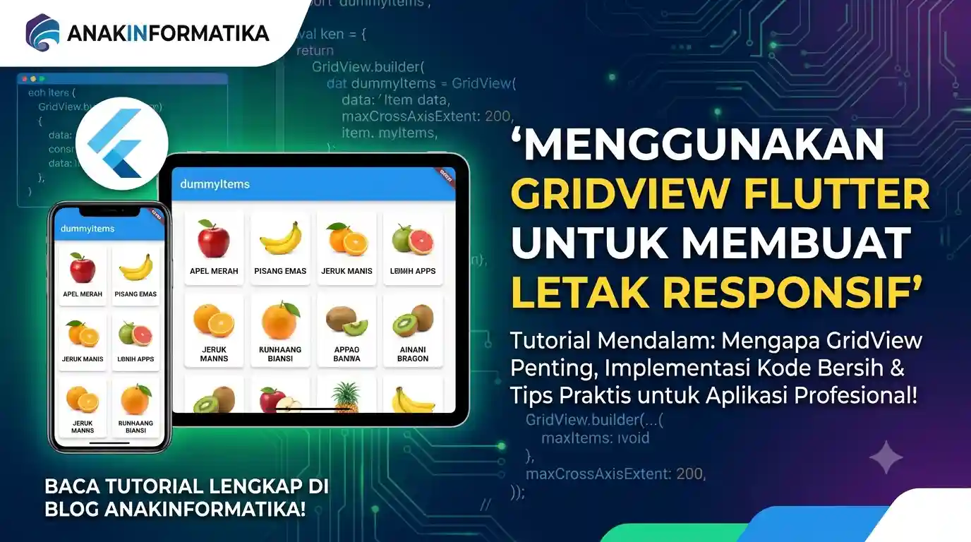
Try resizing your emulator or browser window (if running on Flutter Web), or rotate your test device. You will notice how the number of columns dynamically adjusts based on the screen width while keeping each item's width strictly below 200 pixels. This is a stellar example of utilizing Flutter's GridView to create highly adaptive layouts!
Practical Tips and Best Practices
1. Using LayoutBuilder for Granular Control
While SliverGridDelegateWithMaxCrossAxisExtent handles responsive layouts brilliantly out of the box, you might occasionally want precise control—such as defining rigid columns at exact screen breakpoints or changing the item design completely on larger displays. For this, you can turn to LayoutBuilder.
// Example of using LayoutBuilder to dynamically set crossAxisCount
class ResponsiveGridViewWithLayoutBuilder extends StatelessWidget {
  const ResponsiveGridViewWithLayoutBuilder({super.key});

  @override
  Widget build(BuildContext context) {
    return Scaffold(
      appBar: AppBar(title: const Text('LayoutBuilder GridView')),
      body: LayoutBuilder(
        builder: (context, constraints) {
          int crossAxisCount = 2; // Default for small screens
          if (constraints.maxWidth > 600) {
            crossAxisCount = 4; // 4 columns for wide screens
          } else if (constraints.maxWidth > 400) {
            crossAxisCount = 3; // 3 columns for medium screens
          }

          return GridView.builder(
            gridDelegate: SliverGridDelegateWithFixedCrossAxisCount(
              crossAxisCount: crossAxisCount,
              childAspectRatio: 1,
              crossAxisSpacing: 10,
              mainAxisSpacing: 10,
            ),
            itemCount: dummyItems.length,
            itemBuilder: (context, index) {
              final item = dummyItems[index];
              return Card(
                child: Center(
                  child: Text(item.title),
                ),
              );
            },
          );
        },
      ),
    );
  }
}
In this snippet, LayoutBuilder exposes the layout constraints passed down by the parent widget. By checking constraints.maxWidth, we can swap out configuration values inside SliverGridDelegateWithFixedCrossAxisCount depending on our application's exact breakpoint rules.
2. High Performance for Large Grids (Infinite Scrolling)
If you are working with massive datasets or setting up infinite scrolling where data loads as the user scrolls down, keep these optimization rules in mind:
-
Always use GridView.builder: It strictly renders visible items, conserving memory and ensuring high frame rates.
-
Implement Pagination: Avoid downloading all your data at once. Fetch data in chunks (e.g., 10–20 items per request) and show a loading spinner at the bottom of your grid when fetching more.
-
State Management: Leverage state managers like Riverpod, Bloc, or Provider to track your listing state and pagination progress effortlessly.
3. Customizing Grid Items
Your grid elements do not have to be basic cards. You can easily craft elaborate UI structures using:
-
Stack: Superimpose text, tags, or badges on top of item images. -
Hero Animation: Create visually striking element-linking transitions when navigating to detail pages. -
InkWell: Provide a rich native ripple touch feedback effect instead of a standard gesture wrapper.
4. Handling Empty States
What happens if dummyItems comes back empty? A blank grid can leave users confused. It is best practice to handle empty arrays gracefully:
// Inside your widget's body:
body: dummyItems.isEmpty
    ? const Center(
        child: Text(
          'No items available at the moment.',
          style: TextStyle(fontSize: 18, color: Colors.grey),
        ),
      )
    : Padding(
        padding: const EdgeInsets.all(8.0),
        child: GridView.builder(
          // ... Your GridView implementation
        ),
      ),
5. Using MediaQuery Directly
You can also call MediaQuery.of(context).size.width to pull down the direct width of the current screen context and compute columns math explicitly, although SliverGridDelegateWithMaxCrossAxisExtent takes care of this automatically in most cases.
// Example using MediaQuery for crossAxisCount
class AnotherResponsiveGridView extends StatelessWidget {
  const AnotherResponsiveGridView({super.key});

  @override
  Widget build(BuildContext context) {
    double screenWidth = MediaQuery.of(context).size.width;
    int crossAxisCount = (screenWidth / 150).floor(); // E.g., minimum item width of 150px
    if (crossAxisCount < 2) crossAxisCount = 2; // Keep at least 2 columns

    return Scaffold(
      appBar: AppBar(title: const Text('MediaQuery GridView')),
      body: GridView.builder(
        gridDelegate: SliverGridDelegateWithFixedCrossAxisCount(
          crossAxisCount: crossAxisCount,
          childAspectRatio: 1,
          crossAxisSpacing: 10,
          mainAxisSpacing: 10,
        ),
        itemCount: dummyItems.length,
        itemBuilder: (context, index) {
          final item = dummyItems[index];
          return Card(
            child: Center(
              child: Text(item.title),
            ),
          );
        },
      ),
    );
  }
}
Conclusion
Congratulations! You have successfully mastered Using Flutter GridView to Create Responsive Layouts. We've explored how pairing GridView.builder with SliverGridDelegateWithMaxCrossAxisExtent creates a highly robust system that rearranges elements fluidly across all devices, establishing an ideal user experience.
Remember that responsive design isn't just about scaling grid column counts—it is also about ensuring your text, padding, and inner element content remain accessible and attractive across varying form factors. Keep experimenting with the wide array of parameters Flutter widgets offer.
Happy coding, and don't hesitate to share your amazing responsive creations with the AnakInformatika community!